Bringing the future in line with today
Crunchbase
2024
Brief
Envision Crunchbase 18 months ahead, focusing on key ideas for growth and innovation.
Project details
The earlier work I’d done this year to envision Crunchbase’s future served as a launchpad for exploring ‘what could be.’ With more specific goals—a revamped homepage, an enhanced profile experience, and a refined concept for the AI agent—I transformed those initial ideas into a more contemporary vision. This time, I collaborated closely with the teams responsible for building these features, shaping the concepts into a practical framework to support their ongoing work on the product.
A new home page
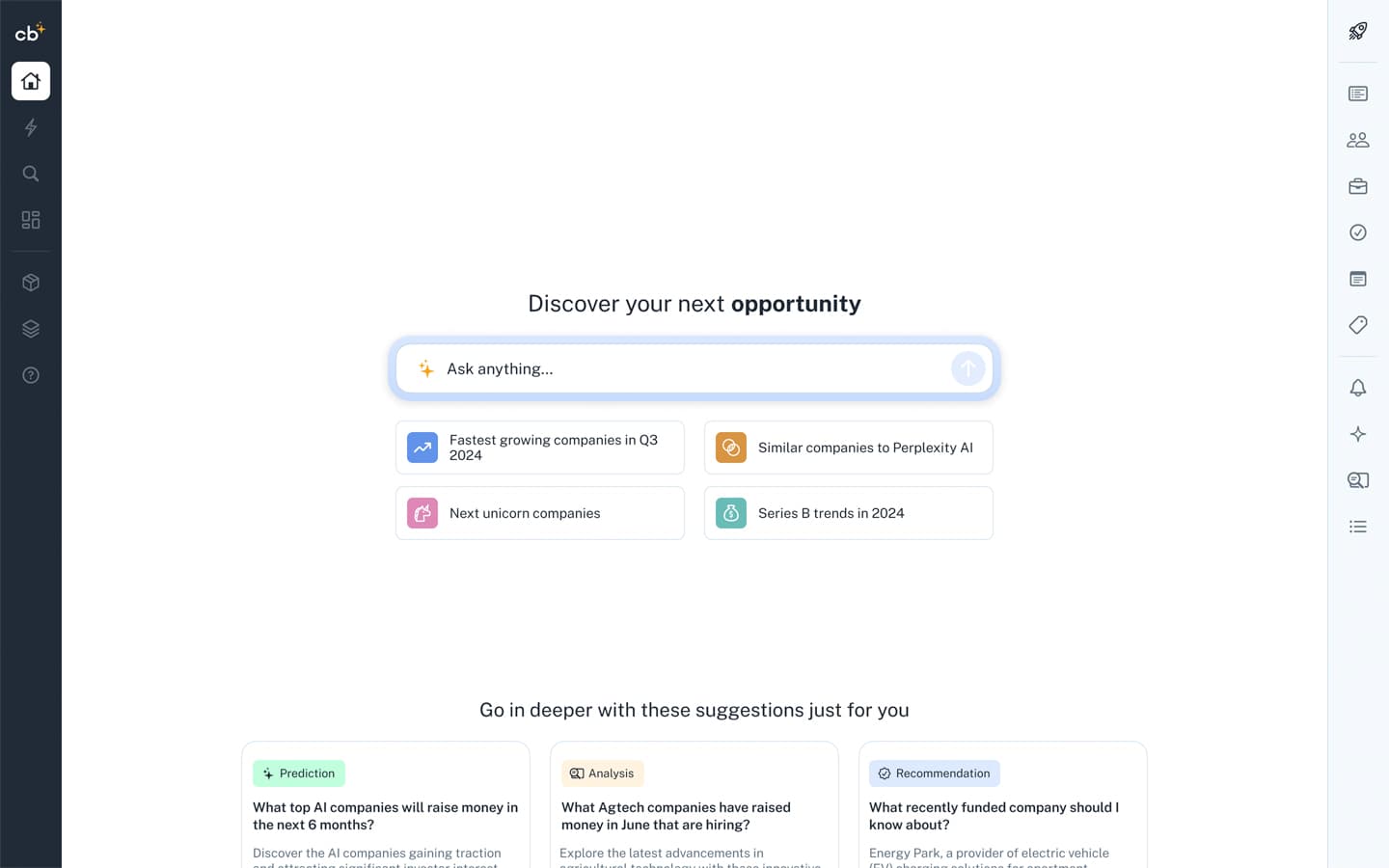
The new homepage focused on engaging users with AI and all the amazing things it can do on top of Crunchbase data. Aside from conversational input, there were quick suggestions, in-depth recommendations based on the user's persona and usage, and new forms of relevant AI-generated content. The simplicity and familiarity of this experience were intentional, encouraging users to quickly jump in without wondering, "Hey, where is my old home page?"
In this iteration, I also explored a new global navigation paradigm—Crunchbase items on the left and personal items on the right. This has been an ongoing challenge, as integrating personal data and user actions with widely understood public information can be tricky. This navigation aimed to distinguish those lines more clearly.
In this iteration, I also explored a new global navigation paradigm—Crunchbase items on the left and personal items on the right. This has been an ongoing challenge, as integrating personal data and user actions with widely understood public information can be tricky. This navigation aimed to distinguish those lines more clearly.
Contextual AI agent
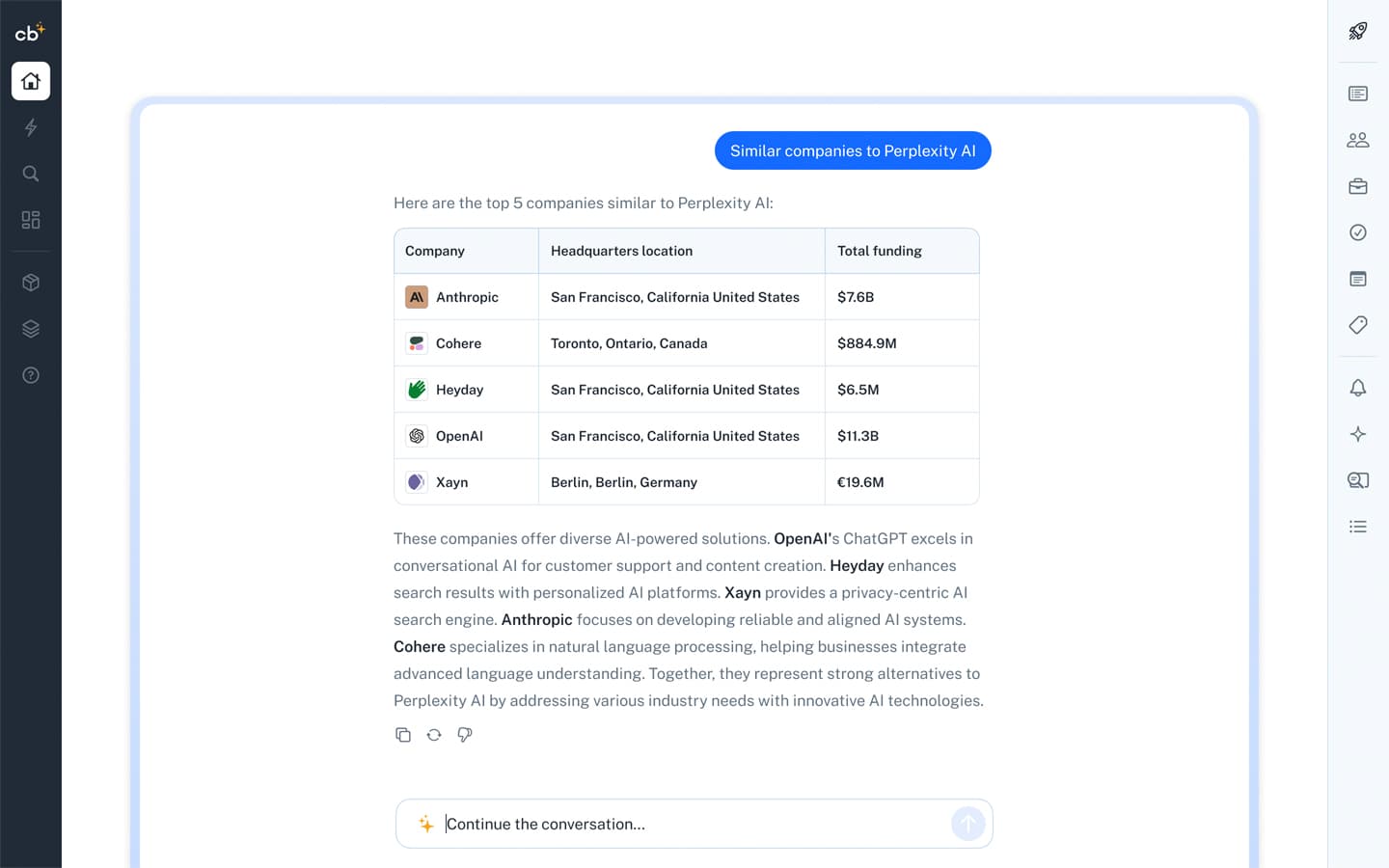
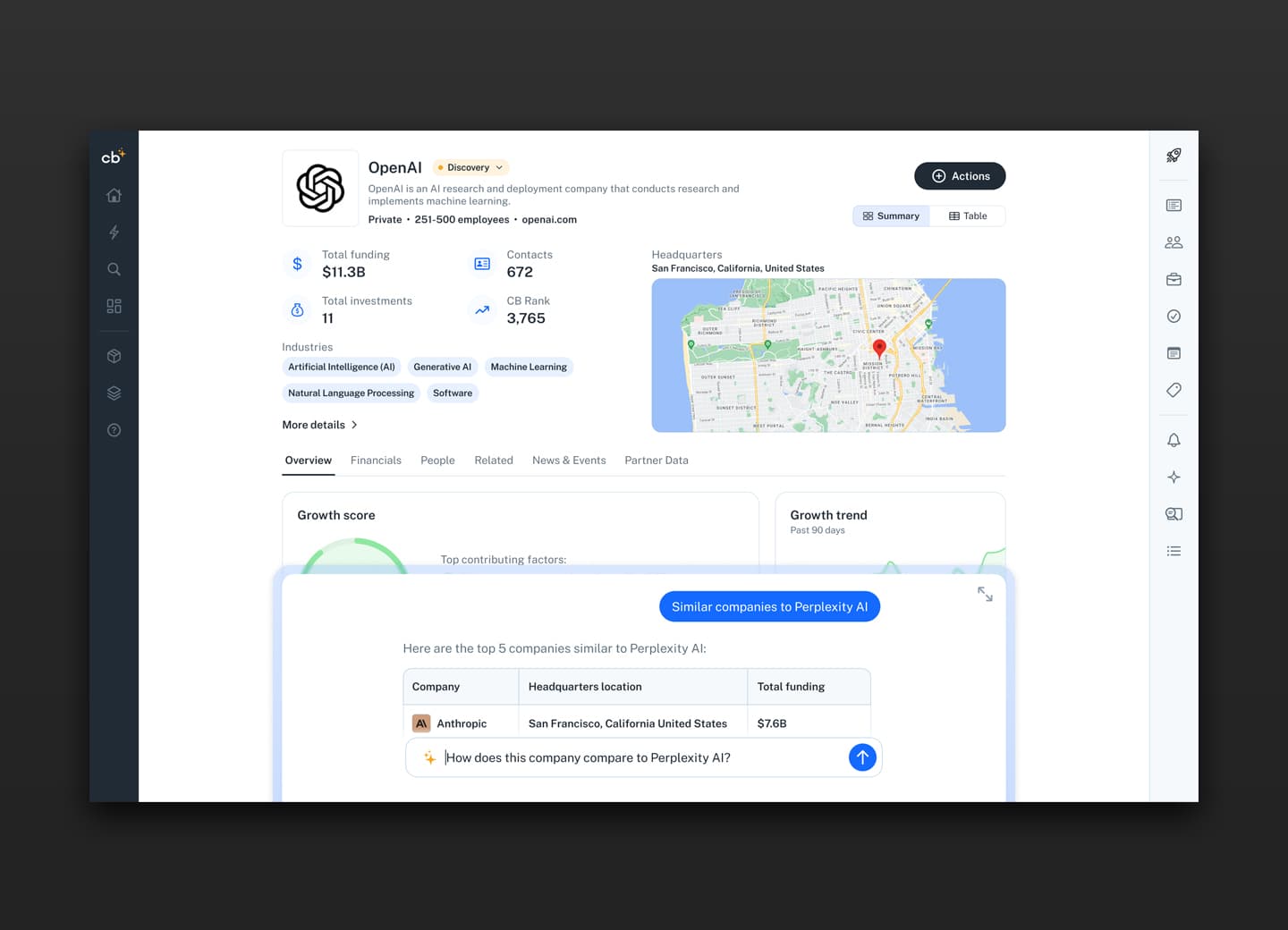
Building on previous explorations, the AI agent lives on top of Crunchbase and takes into account not only what you are currently viewing but also who you are and what your goals are. I focused less on open conversational interaction and more on explicit functionality. After iterating extensively, I landed on this direction to emphasize familiarity. With the proliferation of experiences like ChatGPT, Perplexity, and Claude, having an experience that feels similar to these predecessors would hopefully lessen confusion and encourage users to engage.
The agent is persistent (visible on other screens) and constantly references what is in the viewport, what actions have been taken, and what the user is trying to accomplish, either now or in general. This screen represents a user clicking on one of the quick suggestions on the home page to jump right into the experience.
The agent is persistent (visible on other screens) and constantly references what is in the viewport, what actions have been taken, and what the user is trying to accomplish, either now or in general. This screen represents a user clicking on one of the quick suggestions on the home page to jump right into the experience.
New relevant content
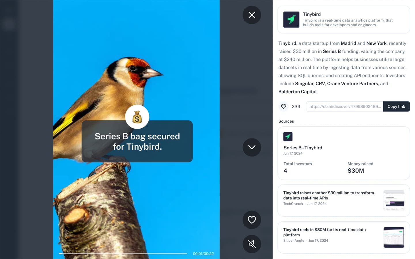
This exploration focused on blending AI image/video creation, voice, and news summarization into bite-sized components. Considering mobile usage and how people consume content today, this screen is a desktop version of that idea. On the left is the generated content—in this example, a short twenty-second video that reads the description on the right. On the right is the entity this content is relevant to, what the content is—in this case, a funding round for the company—the ability to like and share, and the sources that generated this content: the Crunchbase funding round entity and several news sources. While this exact implementation isn't on the immediate horizon, a version of it is in development.
Revisiting the profile
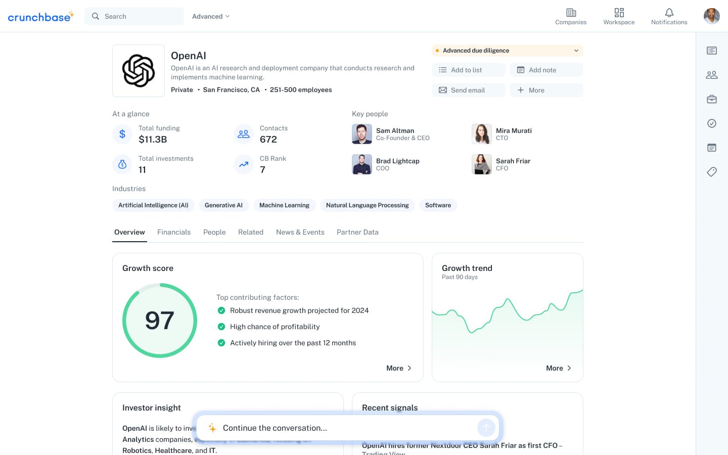
In this version of Crunchbase, where AI is front and center, the profile changes to reflect all the amazing new data. This exploration aimed to determine where and how this new data fits into the profile experience while remaining familiar to the current design. Featuring a top section that provides all the important information upfront and quick access to all functionality, this overview helps users make faster and better decisions when viewing a profile in the first few seconds.
Below is the familiar tab structure in place today that helps organize the wealth of information available on a given profile. The new overview section focuses primarily on insights and analysis, including growth score, growth trend, investor insights, signals, SWOT analysis, potential to disrupt, and more. In addition to focusing on the profile, I revisited the global navigation to align it more closely with what is currently implemented, as this work is ongoing.
Below is the familiar tab structure in place today that helps organize the wealth of information available on a given profile. The new overview section focuses primarily on insights and analysis, including growth score, growth trend, investor insights, signals, SWOT analysis, potential to disrupt, and more. In addition to focusing on the profile, I revisited the global navigation to align it more closely with what is currently implemented, as this work is ongoing.
Digging deeper
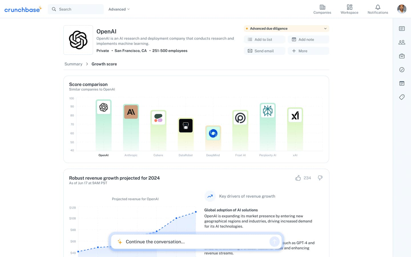
As mentioned, the new overview tab is home to much of the new insights and prediction data. While the overview provides a glimpse of metrics like the growth score, users should be able to delve deeper to understand why the score is what it is. This screen is a scrolled version showing some of the data and reasoning behind a company's score. Whether it's a comparison to similar companies or industries or a predictive analysis of the company's revenue for the rest of the year with supporting rationale, these subpages aim to offer further insight into the "why" behind all the new data.
Proactive agent
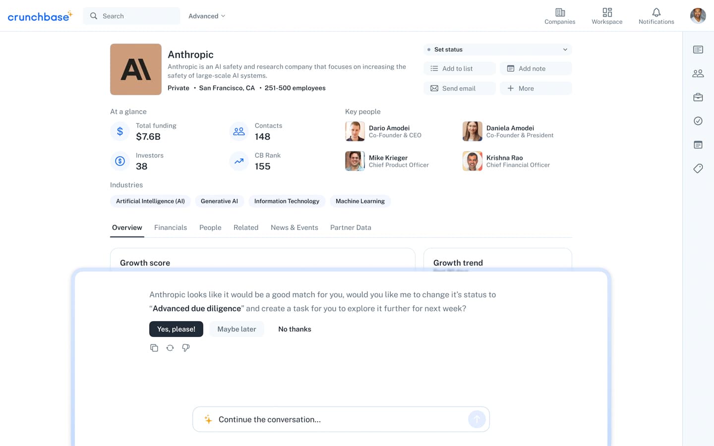
Another exciting aspect of the agent is its ability to be proactive and notify users when it can be of service. It's one thing to have the agent available to answer questions and connect dots for you, but if it can actively look out for you and suggest actions based on everything it knows—that's a game-changer.
In this portion of the prototype, the user has come from OpenAI's growth score comparison and navigated to Anthropic's profile. The agent signals a notification, and the user opens it to a smaller view showing the agent's suggestion—in this case, changing the status of this company in the user's workflow.
In this portion of the prototype, the user has come from OpenAI's growth score comparison and navigated to Anthropic's profile. The agent signals a notification, and the user opens it to a smaller view showing the agent's suggestion—in this case, changing the status of this company in the user's workflow.