SayHi / DownTo
Leap
2023
Brief
Exploring potential product ideas designed to resonate with college students.
Project details
After deciding not to pursue Leap Chats as a product, we shifted our focus to a younger audience—college students. Following a pilot test of a reimagined version of the Leap Chats app at Stanford, we connected with students who provided valuable insights and feedback on what they wanted from a new social platform. Drawing on their input, we brainstormed, researched, and developed concepts, ultimately launching two versions across multiple campuses: one at the end of the '22 school year and another at the beginning of '23. Despite our best efforts and gaining thousands of users, neither app achieved the level of traction we had hoped for.
Matching on campus
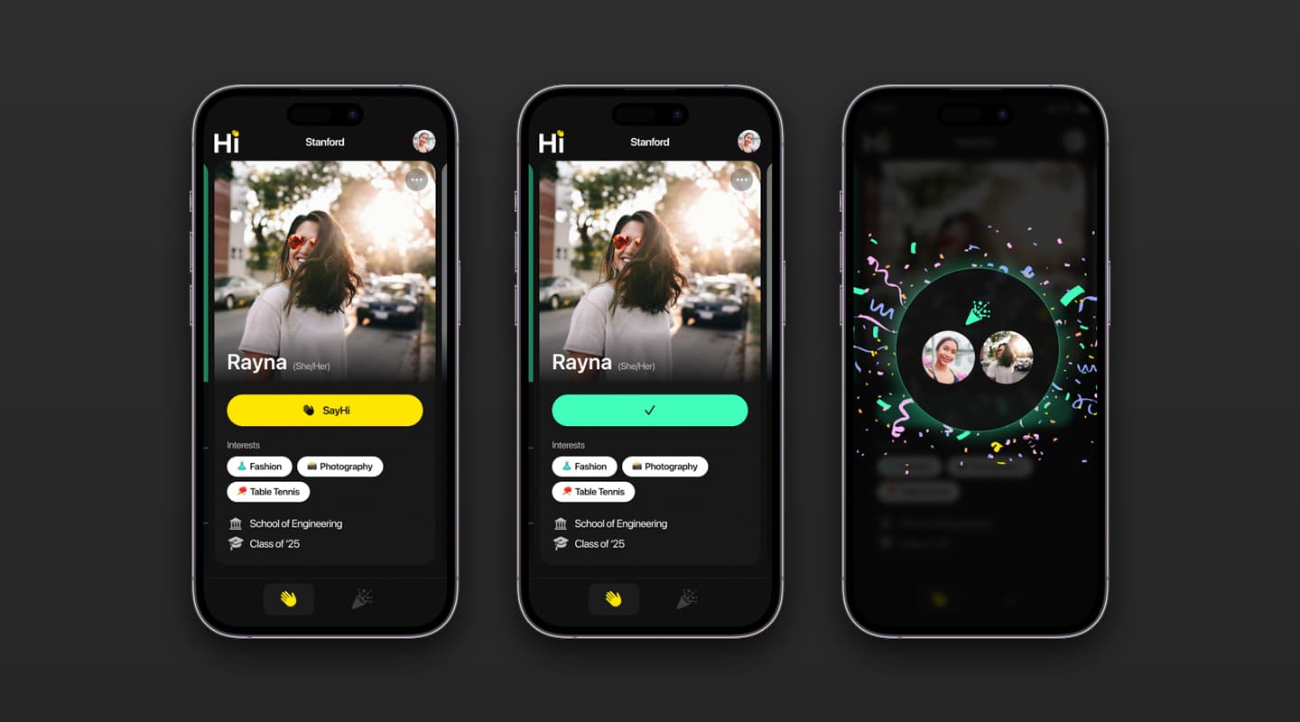
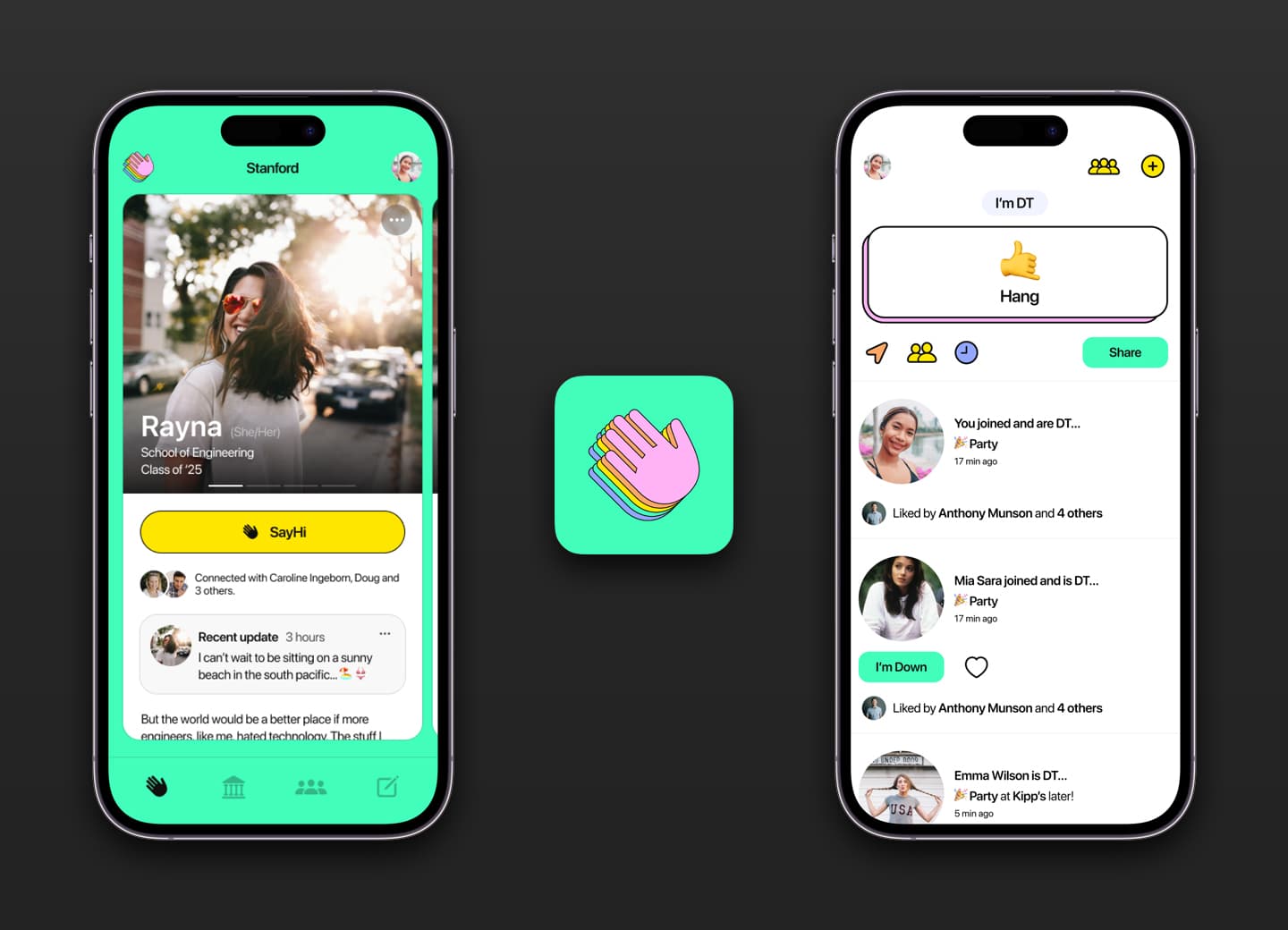
One of the initial insights from students was the challenge of knowing who else was on campus. Interactions were often limited to classmates or social gatherings. Drawing inspiration from other matching apps, we developed the first version of our app, allowing users to sign up, create a basic profile, and swipe through student profiles. If someone caught their interest, they could tap "Say Hi," and if the interest was mutual, a match would be made, unlocking the messaging feature.
Status updates
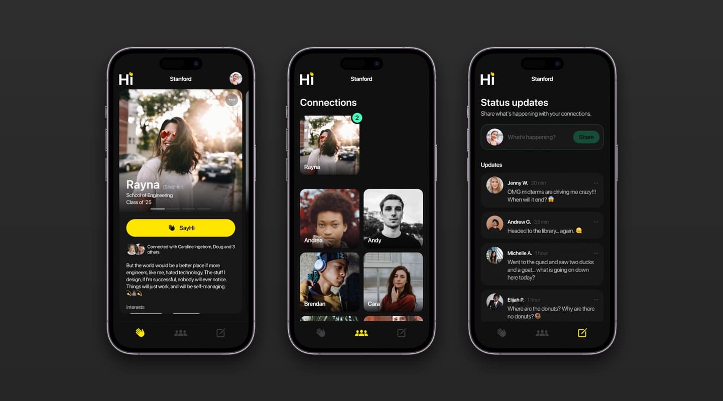
For users who quickly swiped through all potential matches or those not seeking numerous connections, the app initially offered little beyond direct messaging. Feedback from students highlighted a need for a way to broadcast their activities or upcoming plans. In response, we introduced status updates, enabling students to share what they were up to or what they had planned. This feature aimed to increase engagement, providing a more dynamic tool to help students navigate and their best college lives.
Introducing places
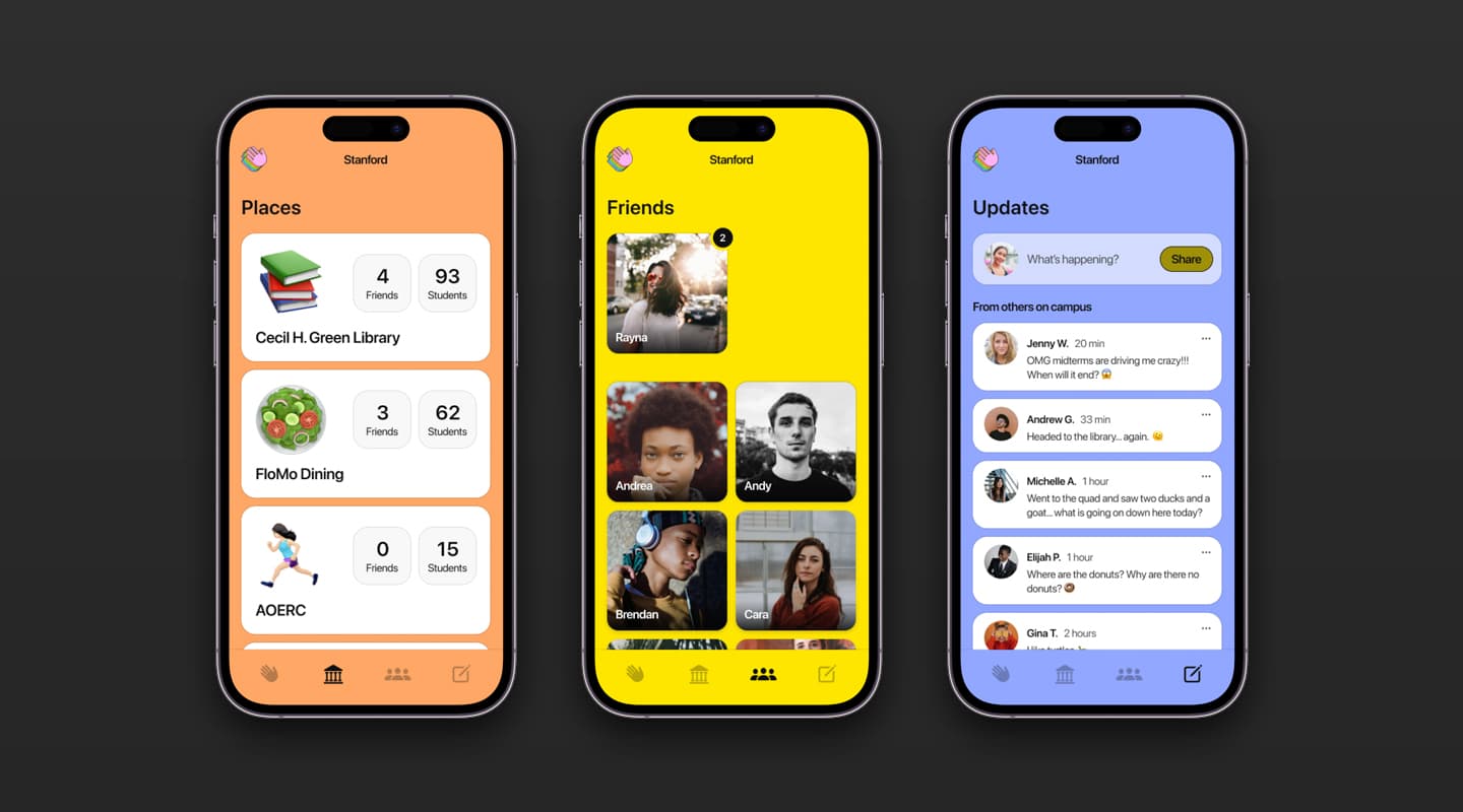
Students expressed a desire to see where others were without the need to type out a status update. In response, we added "Places" to the app. With granted permissions, this feature would detect a user's location, map it against known GPS coordinates, and display the count of users at that location. This allowed users to quickly see if friends were studying at the library or grabbing a bite at the dining hall.
This iteration marked two significant developments. First, it prompted a rebranding to a more colorful and playful aesthetic. Second, it provided meaningful evidence that we were creating something students found genuinely engaging, rather than just a passing novelty.
This iteration marked two significant developments. First, it prompted a rebranding to a more colorful and playful aesthetic. Second, it provided meaningful evidence that we were creating something students found genuinely engaging, rather than just a passing novelty.
Simplification and focus
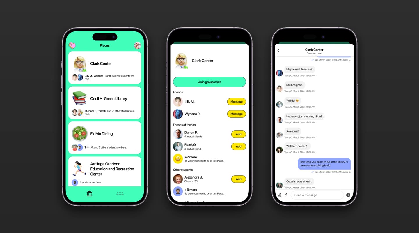
By this point, the app had evolved with multiple features, making it challenging to clearly convey its core purpose. We decided to streamline by removing the matching and status updates to focus exclusively on the "Places" feature. Feedback from students indicated that while they often used Find My with close friends, they were reluctant to share their location with casual acquaintances. This insight allowed us to expand the Places feature, incorporating relationship-based visibility and internal privacy controls.
We also added messaging within specific locations, enabling students to chat with others nearby—essentially creating a geofenced Slack or Discord channel. This version of the app launched at six schools at the end of the '22 school year. While initial feedback was positive, the timing coincided with the end of the academic year, which limited our ability to build momentum over the summer break.
We also added messaging within specific locations, enabling students to chat with others nearby—essentially creating a geofenced Slack or Discord channel. This version of the app launched at six schools at the end of the '22 school year. While initial feedback was positive, the timing coincided with the end of the academic year, which limited our ability to build momentum over the summer break.
Activity sharing made easy
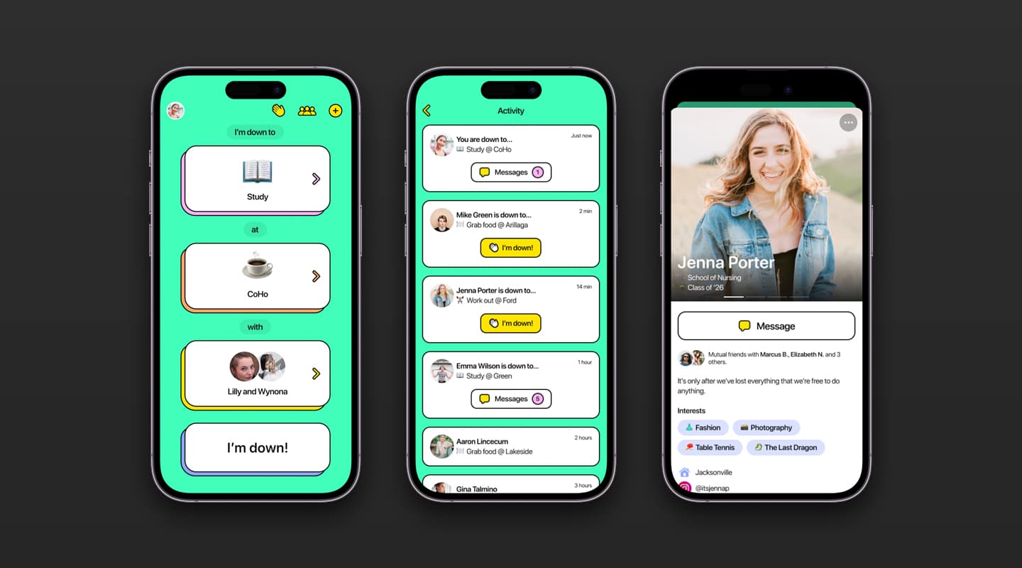
During the summer break, we continued iterating and engaging with students, leading us to a crucial insight: knowing where people are is only part of the equation in answering "What is everyone up to?" We also learned that asking for location sharing caused hesitancy toward adoption. Students wanted a quick way to see what others were doing, where, and when—all without typing or messaging multiple people. We reimagined the app as a single-screen experience, allowing users to select an activity, choose a location, and instantly broadcast it to specific friends or the entire network.
We launched this new version at nine schools at the start of the academic year, staggering each release to introduce one school per week. This approach allowed us to rapidly learn and iterate based on real-time feedback, while I manually entered hundreds of campus locations into our backend. Each place required a name, address, emoji, and designation as a recommended spot for particular activities, making it a time-intensive but essential task.
We launched this new version at nine schools at the start of the academic year, staggering each release to introduce one school per week. This approach allowed us to rapidly learn and iterate based on real-time feedback, while I manually entered hundreds of campus locations into our backend. Each place required a name, address, emoji, and designation as a recommended spot for particular activities, making it a time-intensive but essential task.
The final version
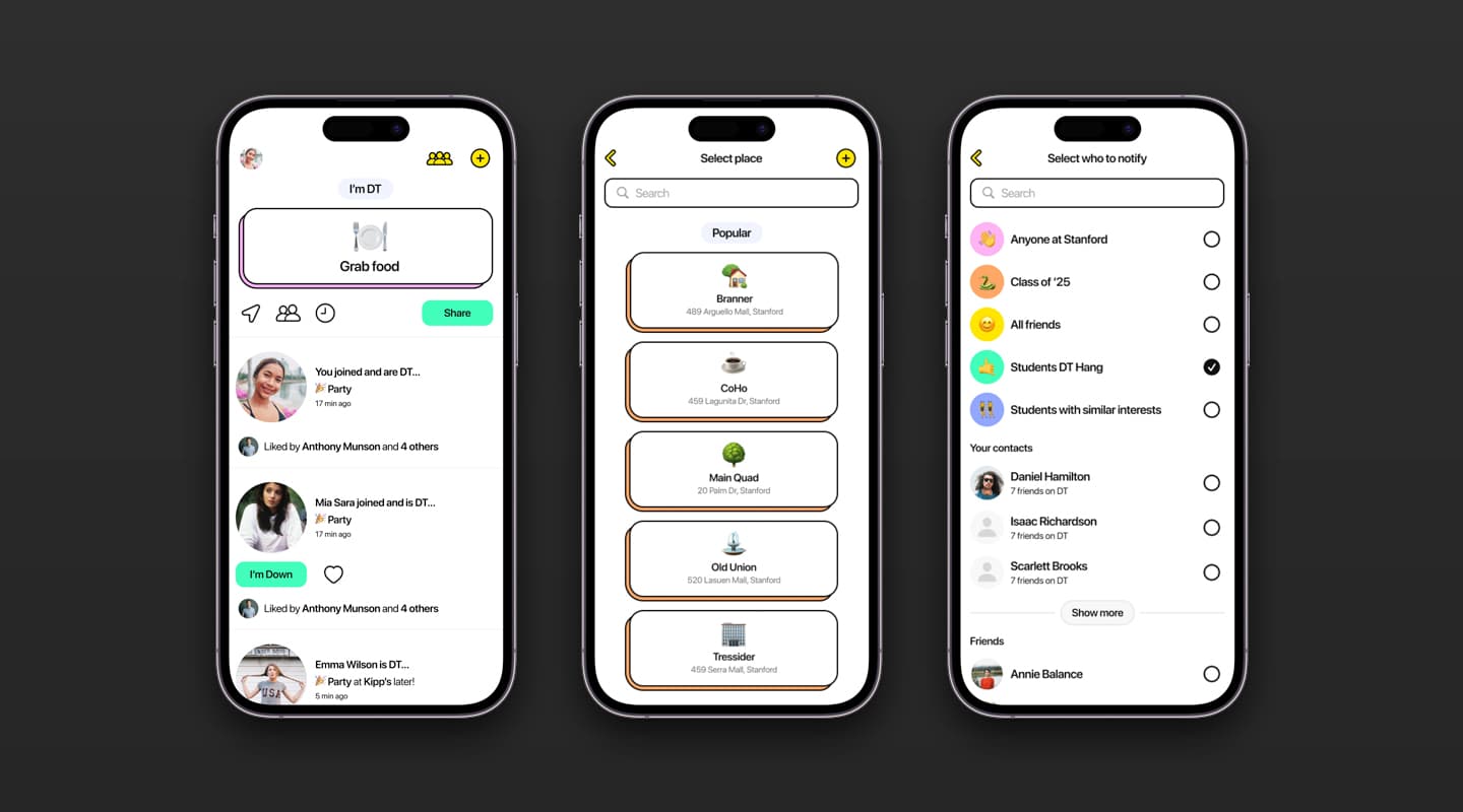
After nearly two months of continuous learning and iteration, we refined the app into a simpler, more cohesive experience. The main screen now prioritized what was happening around campus rather than focusing solely on individual activities. Users could share their plans with optional timeframes, no longer needing to specify a location or specific people. The color palette shifted to a more subtle application, offering a reserved and polished aesthetic.
We also streamlined the process of adding campus hotspots, moving beyond my personal quest to pinpoint popular places—though I like to think I did a pretty good job. Despite meeting our internal goals and metrics for success, we ultimately decided that the app wasn't worth further pursuit. Instead, we chose to dedicate our final months as a team to building a product for ourselves.
We also streamlined the process of adding campus hotspots, moving beyond my personal quest to pinpoint popular places—though I like to think I did a pretty good job. Despite meeting our internal goals and metrics for success, we ultimately decided that the app wasn't worth further pursuit. Instead, we chose to dedicate our final months as a team to building a product for ourselves.